
Martin Peters
Data, python and visualisation enthusiast. Keen cyclist. Husband and father of three children.
House Price Trends in Wicklow, Ireland with Docker, Pandas, PostGIS and QGIS
[postgis postgres ireland property qgis Published Mar 15, 2020
Intro
It’s been a few weeks since my last post. Previously I focused on the introduction of PostGIS concepts, and the walking distance from the Luas. Here I’ll analyse a property transactions dataset for County Wicklow in Ireland. I’ll introduce Docker and how it can be used locally to store geo data, analyse it with Python Pandas/Matplotlib using spatial functions, and visualise with QGIS.
My wife and I owned a property in County Wicklow, Ireland from 2005 to 2019. In 2014, we became accidental landlords when be relocated to County Wexford. We’d followed the property market closely before selling in late 2019. We had purchased the property in 2005 close to the peak of the Celtic Tiger.
Since 2010, each property sale in the Republic of Ireland has been published on the Property Price Register. This dataset includes address and price information. In Wicklow at the time of writing had 12,698 residential transactions listed. I downloaded all records and to view these on a map or carry out spatial analysis I needed to geocode them. Geocoding is a process to convert addresses to locations (lat/lon). There are a number of freemium and commercial tools available for this including Autoaddress, Google, and HERE to name just a few. I’ve used Google’s geocoder as there’s a $200 free monthly credit which allowed me to geocode the 12k records free of charge.
Background
Docker
Docker allows you to build, run and share applications with containers. Installation details can be found on the Docker Documentation page. An example image available on Docker hub is a Postgres/Postgis Image. Using this you can have a database running within a container on your local machine.
After installing Docker. Create a folder (e.g. Wicklow_PPR) with a Dockerfile that has the following content:
version: '3.2'
services:
  db:
    image: kartoza/postgis
    environment:
      - POSTGRES_USER=admin
      - POSTGRES_PASS=superSecretPassword!
      - POSTGRES_DBNAME=db
      - POSTGRES_MULTIPLE_EXTENSIONS=plpgsql,postgis,hstore,postgis_topology,pgrouting,cube
      - ALLOW_IP_RANGE=0.0.0.0/0
    ports:
      - 25432:5432
    command: sh -c "echo \"host all all 0.0.0.0/0 md5\" >> /etc/postgresql/10/main/pg_hba.conf && /start-postgis.sh"
Then is as easy as running a docker-compose command which will create a container with a postgis-enabled postgres instance. Once spun up you can connect to it using your preferred SQL client or using the cli:
# Docker Compose
docker-compose up -d --build db

# Access the database using the cli
psql --host localhost --port 25432 --username admin --dbname ddb
Python with Pandas & Matplotlib
Pandas and Matplotlib are two popular Python packages for carrying out data analysis and visualising results. You can import various file types into Pandas including csv, xls, json etc. creating a so called dataframe. You can manipulate the dataframe like you would a sheet in Excel or table in SQL - selecting, filtering, joining, pivoting, filling missing data, aggregating etc.
QGIS
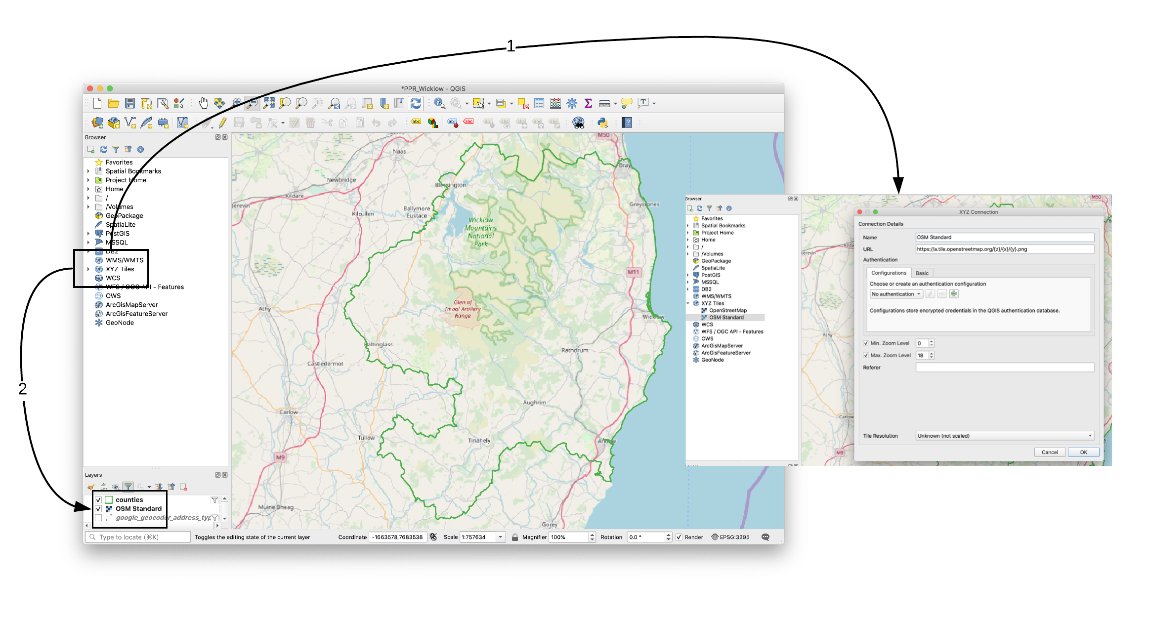
QGIS is an open source Geographic Information System available available to download and install on all major operating systems. There’s extensive documentation on using it and on GIS in general.
QGIS can be used amongst other things to display points and polygons on top of base maps. The base map I’ve used here comes from OpenStreetmap. Details of using OSM Tile Servers can be found here. The standard osm basemap includes roads and rail networks, and water features.
Dataset & Analysis
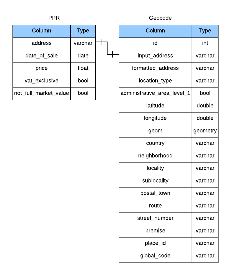
I ended up with two tables in the Postgis-enabled Postgres database. There’s a one-to-one relationship between the the address field in the PPR table and the input_address field of the geocode table.
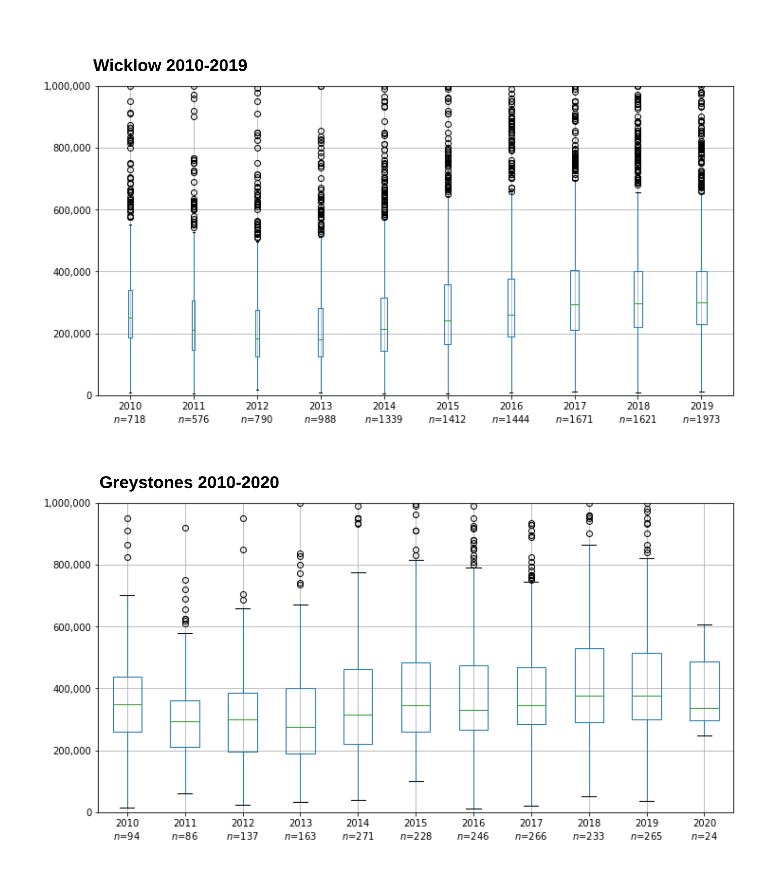
Using just the PPR dataset we can see the price trends over time.
I’ve use a Box plot to
illustrate the trend (See code below). The median price (green line) has
steadily improved from 2013 onwards. Unfortunately, I don’t have data from the
Celtic Tiger period (1995-2007) to compare. The quantity of transactions
has also increased as more confidence in the market has returned and as more
accidental landlords are now able to exit more easily. The PPR dataset
also includes dimensions for Vat Exclusive and Not full market value
(reasons not listed). New property transactions are exempt from VAT at
13.5%.
The size of the boxes were adjusted to reflect the number of transactions in the that year (Sample size in Boxplots).
| Vat exclusive | Not full market value | Count |
|---|---|---|
| No | No | 9,659 |
| Yes | No | 2,392 |
| No | Yes | 477 |
| Yes | Yes | 150 |
Taking a closer look at the geocoding results we can use the ‘location_type’ field. The table below shows that over 65% of geocoding processes resulted in an exact location been returned.
Some notes on Google’s Geocoder, I provided a bounding box:
{
  "southwest": "51.0,-11.0",
  "northeast": "56.0,-5.7"
}
and a region (“ie”) to ensure Irish results were preferred (More details can be found here). I also filtered out any record that did not return with Ireland as the value of country. More details of the code to geocode addresses will be the focus of another post.
| location_type | Count |
|---|---|
| APPROXIMATE | 1,368 |
| GEOMETRIC_CENTER | 2,280 |
| RANGE_INTERPOLATED | 744 |
| ROOFTOP | 8,247 |
Here are the transactions plotted on a map coloured by ‘location_type’ field. The APPROXIMATE results are often in the countryside where addresses are often non-unique.

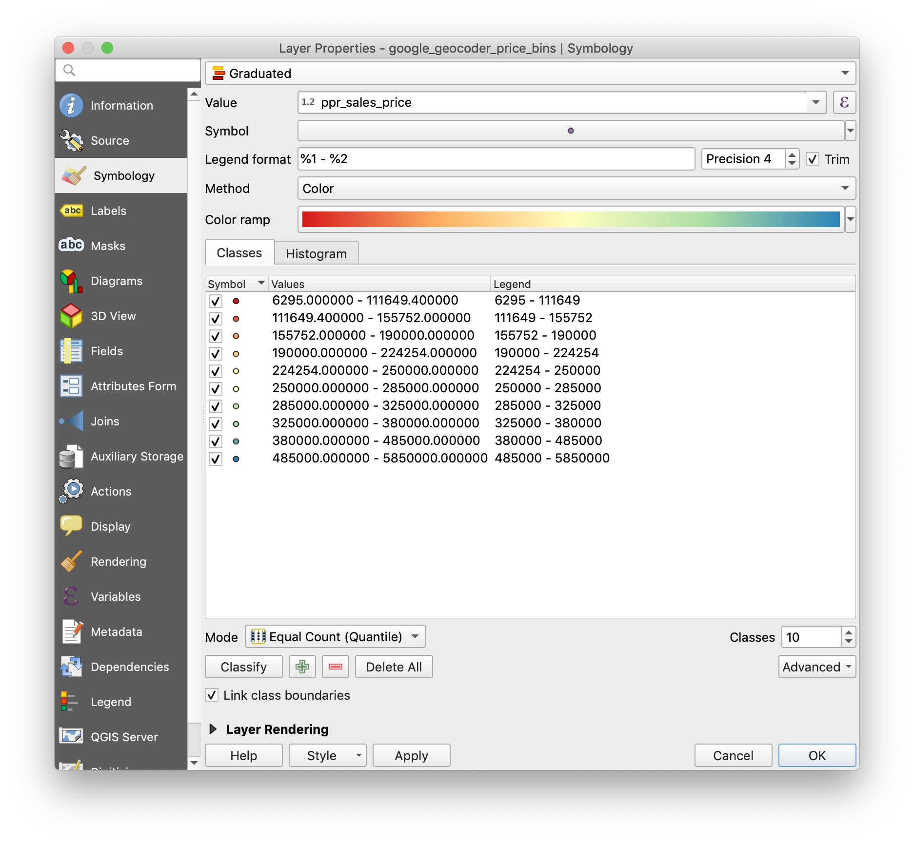
The analysis gets more interesting when we combine both the PPR and Geocoding results together. The price field is a continuous variable ranging from €11,000 to €1,850,000. To display this on a map it is convenient to convert to a dimension of price bins. Here we can easily see the most expensive properties are location around the Bray/Greystones area.
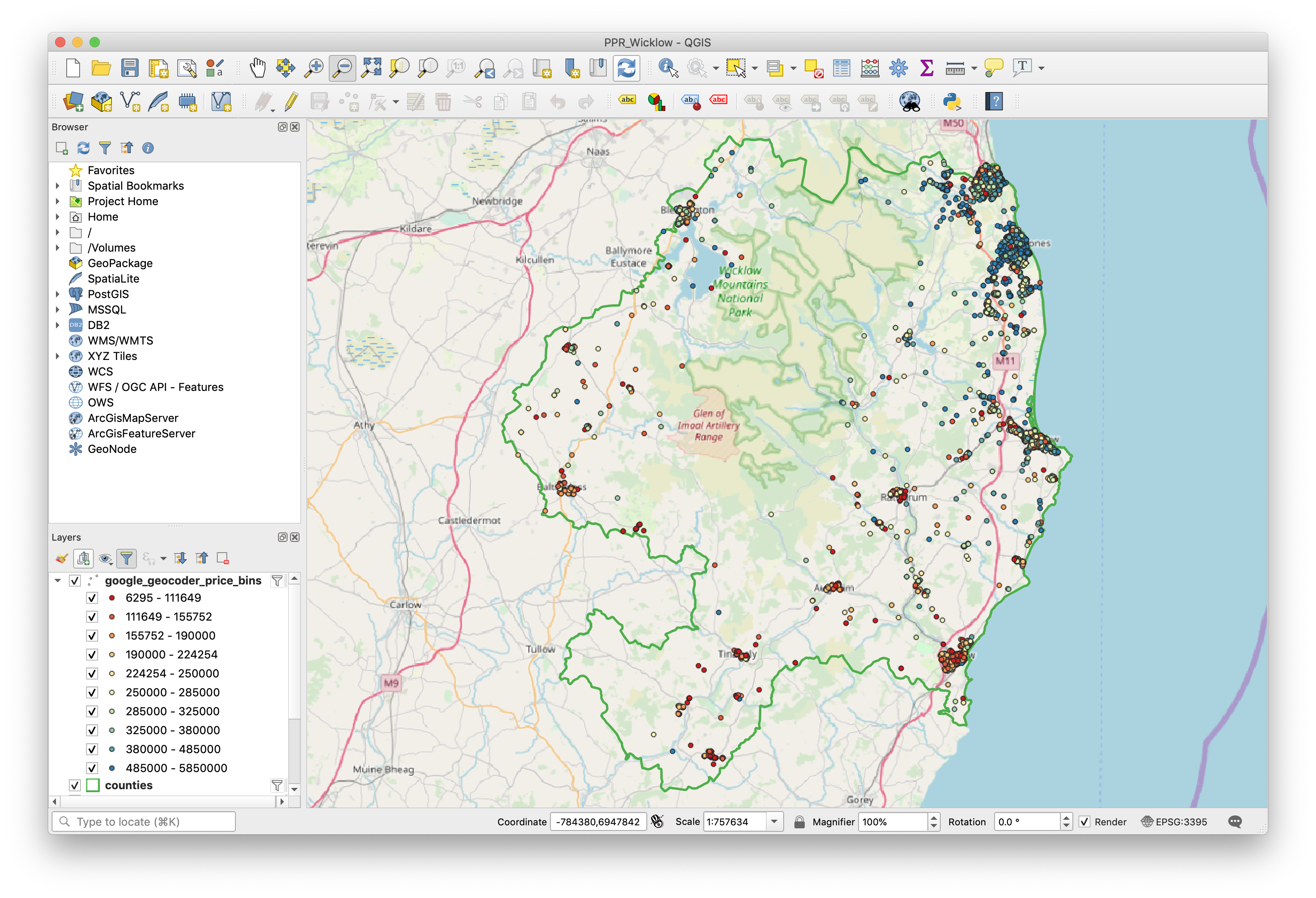
The bin sizes were automatically defined with QGIS using a graduated scheme of 10 evenly sized buckets:
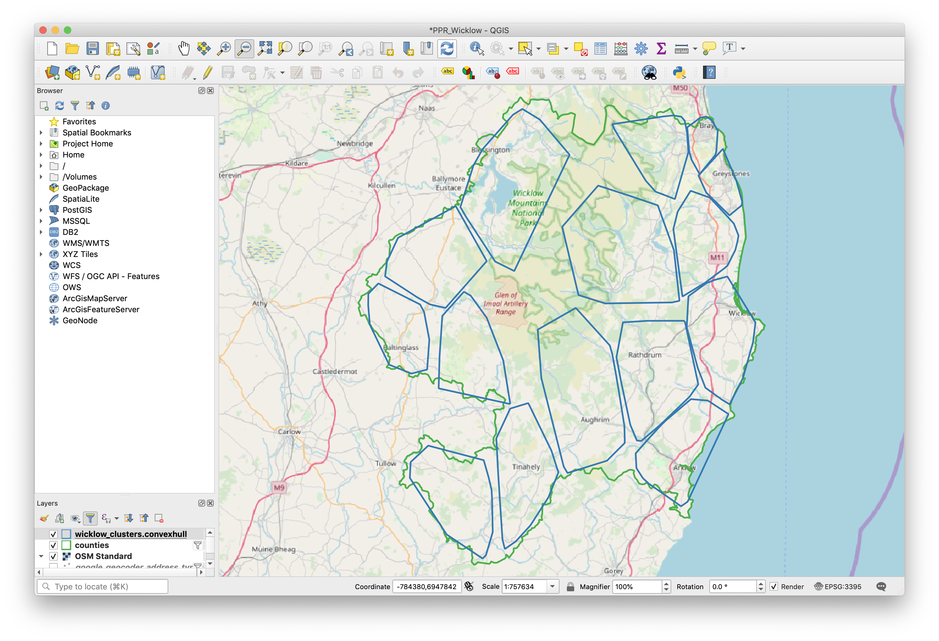
There is some obvious clusters of property transactions within County Wicklow based around the population centres such as Bray, Greystones, Wicklow Town, Arklow, Baltinglass, Blessington etc. Using a k-means algorithm following an example on stackexchange I clustered the data into 15 groups (arbitrarily set number) and I gave each group a label (largest town name). This allowed me to repeat the time series analysis but one level deeper.
CREATE OR REPLACE VIEW wicklow_clusters AS
SELECT
    kmean,
    count(*),
    ST_MinimumBoundingCircle(ST_Union(geom)) AS circle,
    sqrt(ST_Area(ST_MinimumBoundingCircle(ST_Union(geom))) / pi()) AS radius,
    ST_SetSRID(ST_Extent(geom), 4326) as bbox,
    ST_CollectionExtract(ST_Collect(geom),1) AS multipoint,
    ST_ConvexHull(ST_Collect(geom)) AS convexhull
FROM
(
    SELECT
           ST_ClusterKMeans(geom, 15) OVER() AS kmean,
           ST_Centroid(geom) AS geom
    FROM geocode g
    INNER JOIN ppr s ON s.id = g.nk
    WHERE
      source = 'ppr'
      AND s.address5 = 'Wicklow'
      AND g.administrative_area_level_1 = 'County Wicklow'
) tsub
GROUP BY kmean
ORDER BY count DESC;

CREATE TABLE wicklow_cluster_names (
  id integer,
  name varchar(64)
);

INSERT INTO wicklow_cluster_names(id, name)
VALUES
  ( 0, 'Baltinglass'),
  ( 1, 'Wicklow Town'),
  ( 2, 'Kiltegan'),
  ( 3, 'Shillelagh'),
  ( 4, 'Tinahely'),
  ( 5, 'Dunlavin'),
  ( 6, 'Aughrim'),
  ( 7, 'Arklow'),
  ( 8, 'Roundwood'),
  ( 9, 'Blessington'),
  (10, 'Rathdrum'),
  (11, 'Enniskerry'),
  (12, 'Newtownmountkennedy'),
  (13, 'Bray'),
  (14, 'Greystones');

-- Previously owned Greystones property dataset
SELECT
    s.id, s.date_of_sale, s.price,
    s.not_full_market_value,
    s.vat_exclusive, s.address_complete,
    g.geom,
    wcn.name as cluster_name
FROM geocode g
INNER JOIN ppr s ON s.id = g.nk
JOIN wicklow_clusters wc ON ST_Contains(wc.convexhull, g.geom)
INNER join wicklow_cluster_names wcn ON wcn.id = wc.kmean
WHERE
      source = 'ppr'
      AND s.address5 = 'Wicklow'
      AND administrative_area_level_1 <> 'County Wicklow'
      AND wcn.name = 'Greystones'
      AND vat_exclusive = 'No' AND not_full_market_value = 'No' -- 2nd Hand
;
| Cluster | Count |
|---|---|
| Baltinglass | 258 |
| Wicklow Town | 2,002 |
| Kiltegan | 73 |
| Shillelagh | 89 |
| Tinahely | 270 |
| Dunlavin | 191 |
| Aughrim | 246 |
| Arklow | 1,234 |
| Roundwood | 181 |
| Blessington | 620 |
| Rathdrum | 427 |
| Enniskerry | 257 |
| Newtownmountkennedy | 848 |
| Bray | 2,354 |
| Greystones | 3,058 |
Though only a couple of months into 2020, the median price trend is down from previous years and similar to 2017 levels. See the Greystones Box plot above.
Note, this analysis does not take into account details of each property such as its condition, number of bedrooms/bathrooms, square footage, garden size, etc. Thus the trends in price should be taken with a pinch of salt.
I hope this post illustrated some of the things you can do with free resources such as Postgres/PostGIS, Pandas & Matplotlib and QGIS.
Code to generate the Box plots
requirements.txt file for python packages.
psycopg2
pandas
python-dotenv==0.10.3
matplotlib
import psycopg2
import sys, os
import numpy as np
import pandas as pd
import pandas.io.sql as psql
import matplotlib.pyplot as plt
from dotenv import load_dotenv, find_dotenv
import matplotlib as mpl

# .env file contains variables PGHOST, PGDATABASE, PGUSER, PGPORT and PGPASSWORD
load_dotenv(find_dotenv())

PGHOST = os.getenv('PGHOST')
PGDATABASE = os.getenv('PGDATABASE')
PGUSER = os.getenv('PGUSER')
PGPORT = os.getenv('PGPORT')
PGPASSWORD = os.getenv('PGPASSWORD')

conn_string = "host="+ PGHOST +" port="+ "5432" +" dbname="+ PGDATABASE +" user=" + PGUSER \
+" password="+ PGPASSWORD
conn=psycopg2.connect(conn_string)
cursor = conn.cursor()

def load_data():
    sql_command = """
    select
       id, date_of_sale,
       price, vat_exclusive,
       not_full_market_value,
       date_part('YEAR', date_of_sale)::character varying as year
    from public.ppr
    where
       address5 = 'Wicklow'
       and date_of_sale < '2020-01-01'
    ;
    """
    data = pd.read_sql(sql_command, conn)
    return (data)

df = load_data()
years = ['2010', '2011', '2012', '2013', '2014', '2015', '2016', '2017', '2018', '2019']

df_pivot = df.pivot(index='id', columns='year', values='price')
df_year = df.groupby('year')

counts = [len(v) for k, v in df_year]
total = float(sum(counts))
cases = len(counts)
widths = [c/total for c in counts]

myFig2 = plt.figure(figsize=[12, 6])
cax = df_pivot.boxplot(column=years, widths=widths)
sample_sizes = ['%s\n$n$=%d'%(k, len(v)) for k, v in df_year]
cax.set_xticklabels(sample_sizes)
cax.get_yaxis().set_major_formatter(
  mpl.ticker.FuncFormatter(lambda x, p: format(int(x), ','))
)
axes = plt.axes()
axes.set_ylim(bottom=0, top=1000000)
Archive
ireland postgres postgis aws random qgis property geospatial